For our final project, the team worked well as usual. Everyone was able to come together and bring in the knowledge they gained from all of our previous projects to outline a project that we felt was good enough to present. For the most part, everyone had the same ideas for key elements that we must have in our project such as a search bar, easy to navigate search page and working buttons. These are key aspects that frustrated us when they were not working or not easy to find on the websites in our previous projects. This is the reason why we heavily emphasized that these features must work. My role in the project changed a little compared to the previous project. For other projects, I always did the purpose, scope, and audience part but for the final project, we decided to switch it up a bit and took the responsibility of sustainability. It was a nice change because it was cool to see what my other teammates usually do. Our team worked well. Everyone did their part and came together to make a good looking presentation and helped one another. What I’m particularly proud of is how the team worked together because as it was finals week everyone was super busy with final projects and studying for exams. Everyone still made time to come together and make sure everyone’s parts came together and blended well. If we were to do this differently I believe we would probably make some slight changes to our PowerPoint because of the limited time we had due to finals we didn’t spend as much time as we normally would making our presentation look good.
Disability Digital Archive
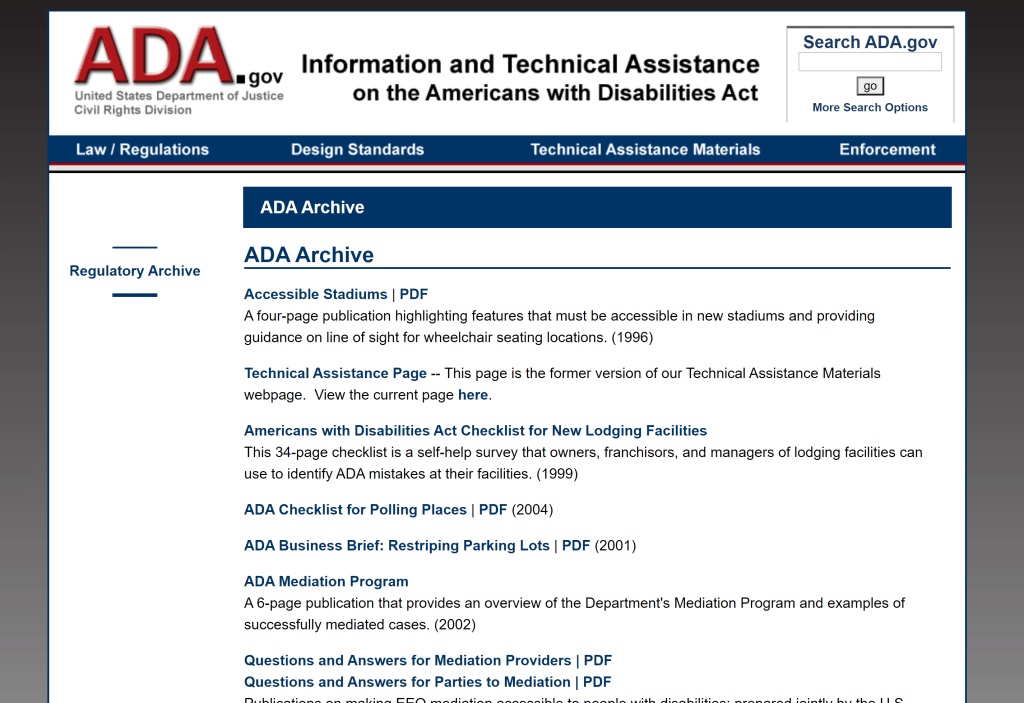
The digital archive that I was looking at today is from the ADA United States Department of Justice civil rights division. The purpose of their digital archive is the store ADA-related government documents. For example, some of the documents they have talked about what are facilities new stadiums must implement, a checklist for polling places, and refueling assistance at self-serve gas stations. To me, the archive just looks like a conglomerate of random government documents and letters pertaining to disability. I don’t believe the archive would personally help disabled people however, I believe establishments that are looking forward to being more accessible to the people then some documents would be useful. Other than that I don’t see how the archive can be of use.
Link to the archive: https://www.ada.gov/ada_archive.htm#reg-arch
Open document settingsOpen publish panel
- Page
- Paragraph
Vidoe Game Accessibility
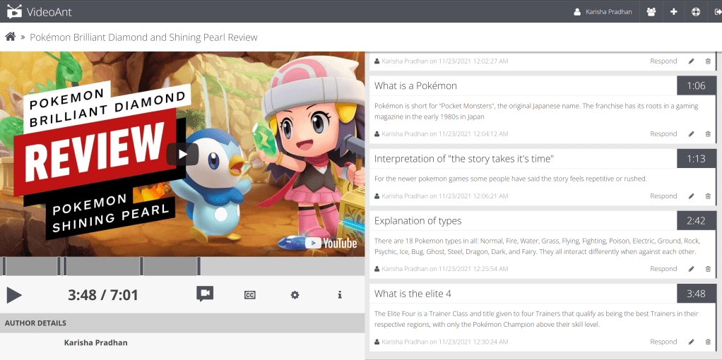
The game I was looking at today was Pokemon brilliant diamond and shining pearl as it recently just came out. It’s sold only on Nintendo Switch consoles and is developed by ILCA. The game is about the adventures of a new Pokémon trainer who strives to become the Pokémon League Champion by collecting and training Pokémon. Like most games in the series, Diamond and Pearl feature eight Pokémon Gyms led by Gym Leaders, professional trainers whose expertise lies in a particular Pokémon type. Gym Leaders serve as bosses and reward skilled trainers with Gym Badges, the key to the advancement of the plot. As with all core games, the protagonist must also thwart the schemes of a crime syndicate, in this case, Team Galactic, who plan to use Pokémon to create a new universe just for themselves, while destroying the current one.
As for accessibility, there were not many features implemented to make the game more inclusive. When you start the game, you choose what language you want and create your character. Besides that, there are no other settings where you could adjust how the game is. If you click the settings button, you’ll see you can change the text speed, change window, battle effect and style, gyroscope and, fossil digging screen. The only settings that could make playing the game better for players with disabilities are text speed, gyroscope, and fossil digging screen. Text speed allows users to speed up or slow down the text. Gyroscope allows users to change the orientation of the camera. Lastly, the fossil digging screen allows users to change the setting where the screen “shakes” when it’s being loaded into the fossil digging game. The settings are easy to find and easy to change as you just have to toggle most of them on or off. However, there are no descriptions for the settings. That would make it harder for people who don’t know what the settings mean as they would have to guess and check what the settings mean. The game does have some accessibility features but I feel as if the game could have more because the game only covers some cognitive features and doesn’t cover physical disabilities at all.
Nintendo’s website from the game:

Blog 8:
In 2017 Google Maps added a feature where mobile users can add information about wheelchair accessibility to business listings. This is similar to other crowdsourcing projects from other companies such as Microsoft Access Earth and Access Now. The purpose of these projects is to make navigation easier for disabled people. Despite large companies adding new features such as these, some aspects of them such as their technological tools, methods, users, and philosophies of access remain underexplored. In my opinion I believe that we are taking the right steps toward making things more inclusive however there is still more to be done. By large companies making a push toward adding these new features show that things are being done and change is being made. Additionally, the topic of Mapping Access has been the topic of discussion in this article. The benefits of it are that it offers a methodological tool for finding the politics of design in everyday things such as restroom signs, height of doorknobs, which change people to be more aware of the world they live in. This results in the definition of users who are typically excluded from build environments such as disabled, racialized, trans and gender-nonconforming people. Recently Mapping Access has taken a shift to a different side. The university the article talks about is attempting to integrate the element of mapping access methodology. This process is referred to as an in forming an intersectional approach to land use because difficult questions that are not often asked about relating to accessibility into the process of decision-making results in a new perspective being added. I believe this is a good approach because regardless of the type of perspective being added new perspective being added when developing something is always an innovative idea it enables better ideas to be made.
Blog 7:
The article talks about the history of computing. The main question the article asks is “Does computing need to be decolonised, and if so, how should such decolonisation be effected?” and the article aims to introduce a recent proposal presented at the fringes of computing. The article discusses how computing should be considered a colonial phenomenon due to strong stances such as feminism and science and technology studies gives an insight that other disciplines don’t. For example, the disciplines mentioned earlier give an insight into social, economic, and political factors that impact computing. The article describes computing as an “entangled outgrowth of various developments within fields such as logic, mathematics, science, and technology”. While computing is heavily influenced by mathematics and science I don’t think its the right to say it’s an “entangled outgrowth” because technology has proved of many uses in various disciplines, not only in math and sciences. Furthermore, the article discusses how computing is inherently colonial because frowned upon and embodies aspects of colonialism. People who are adopting the decolonial computing perspective are required to consider the gro-politics and body political orientation when designing or theorizing about computing phenomena. Additionally, to embrace the decolonial option. The purpose of this is to ensure no one discipline is over dominating computing to ensure it is well rounded. Decolonial computing is a fairly recent proposal that is currently still being theorized. Some have described it as an “open source” technopolitical orientation. In the future it may be more widely adopted as the topic is further discussed and polished.
Blog 6:
The article talks about how digital labor is usually hidden from people and the power that industry has and how they have the ability to cover up and hide specific information. This part specifically stuck out to me because the most recent project I did in the class had to do with a project that had the goal of educating people on how much money ICE funds to certain companies. While doing that project I learned some pretty interesting things such as that ICE is funding large amounts of money to big-name companies that on the outside don’t seem to have any connection to ICE. On a similar note, the article talks about the positive press on the topic of native Americans being factory workers is overshadowing what is actually happening. The people of the Navajo are being exploited for cheap labor. The press mentions how the crafts of native Americans are helpful for manufacturing microprocessors and how the plant would modernize their culture. They made it seem as if there was a problem with their culture and how it needed modernization. After the plant closed all positive press immediately stopped. The positive press was only there to make it seem like the plant was a good idea. In reality, all the negative effects were covered up. This is similar to the project I had because both talked about true data being hidden to make something seem better than it is.
Blog 2:
During world war 2 the roles of women greatly changed. Since all the men were fighting in the war all the women were expected to fill in their shoes at the jobs they use to work at. Before those jobs were deemed too hard for women to do however, due to the lack of men to work they are suddenly ok for women to work at those positions. The article “When computers were women” says “while college educated engineers considered the task of computing too tedious for themselves, it was not too tedious for the college educated women who made up the majority of computers” (Light.8) This proves that women are more than capable of handling the jobs. Despite not knowing their potential women have been pushed away from jobs that were deemed only for men. This has been the case in the past and is still prevalent today. For example, in STEM women at times will be judged based on their gender and automatically will not be seen as equal to their male coworkers. This can also hinder the growth of technology because if you always look through something from one perspective you can only innovate so much. Different perspectives can make a vast difference because everyone has such a different view on the world. World war 2 happened 76 years ago but this problem still exists and something must be done to change it. This change can not happen overnight as the gender stereotypes are deeply rooted in STEM. But slowly progress can be made if we continuously make an effort to improve ourselves.
Blog 4:
Lately we have been trying to create an algorithm for everything. From food to society we try to fit everything into an equation but that simply can not work. Society is like a beating heart; it has a mind of its own. It can’t be contained in a simple algorithm. Lately whether or not you can keep your job depends on an algorithm. Teachers shouldn’t be judged based on the result of their students because their student’s grades aren’t an accurate representation of the teacher’s teaching skill. At first it may seem like a good idea but from personal experience I disagree. I used to agree with this statement before I took AP Calculus BC. After taking the class my perspective on the topic had changed. I did have a good teacher who taught well but calculus BC is known as one of the hardest classes a high school can have. The class work was understandable but the exams seemed too hard at times, but after taking the AP exam the question difficulty directly correlated with the difficulty of the exam if not they were easier. Calculus BC being such a different class compared to all the other math classes a high schooler can take my classes grades fell into a large range. Some kids were good with the pace that the class was going and others were falling behind. The grades ranged from 98s-37s. My teacher taught well, it was just that the class was difficult. Furthermore, another reason why grades are not an accurate representation is because it depends on the class. The grades of a high school honor class will be vastly different from non honor. From what I have seen in my school honor students tend to care about their grades a lot more than other students. If a teacher had a bad class who had no will to study it would be unfair to the teacher to be fired due to the nature of the class.
Blog 3:
For our reverse engineering project, we got an article about war widows. The purpose of the website is to inform readers about war widows. When we think of war we always think about the fallen hero’s but we never think about their family at home and what they have to go through. My role in the group is to look at the interface and see how user friendly it is. The questions I was in charge of were “First Impressions”, “Takeaways”, and “Purpose, Scope, Audience”. These questions were meant to guide us in the process of finding information. In my opinion, I believe that the questions were pretty good guide points because at times it was easy to lose track of what I was supposed to be looking out for and they helped me stay on track. While researching I learned that the pension that the widows receive was taxed 50 percent. That’s a really big cut for people who depend on their husband’s income to survive. As for the user interface, the website gets the job is done which was to inform readers but it barely passes. When you first open the page you’ll see there is no title picture or header but the menu categories are straightforward. Everything was pretty organized and they even had social media links that let you repost the story that you are reading. The biggest downside of the website is that there is no search bar. If someone wanted to look back for a specific story they would have to scroll all the way to find the story again.
Voyant Text Analysis:
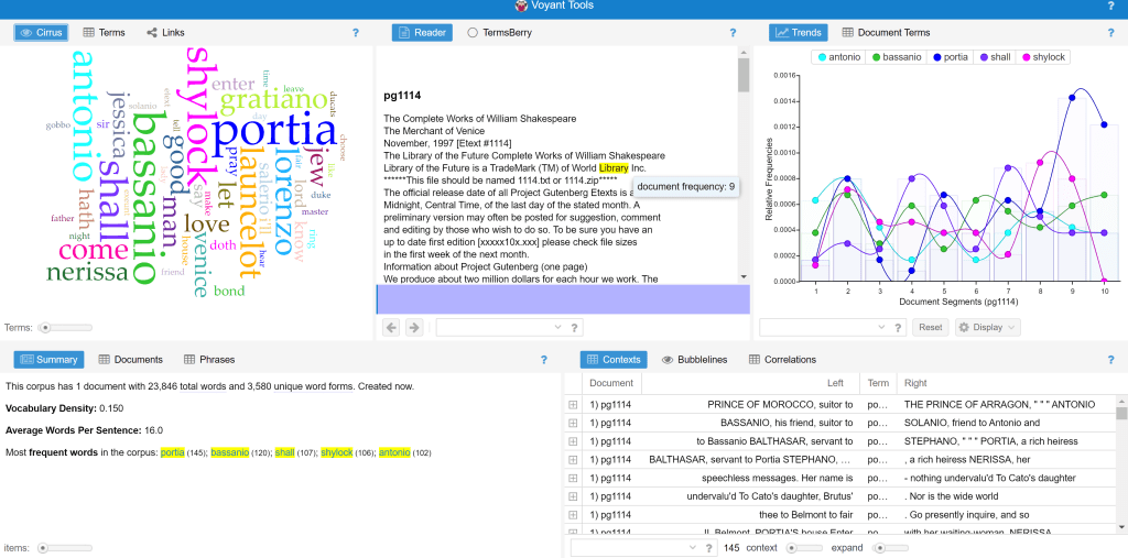
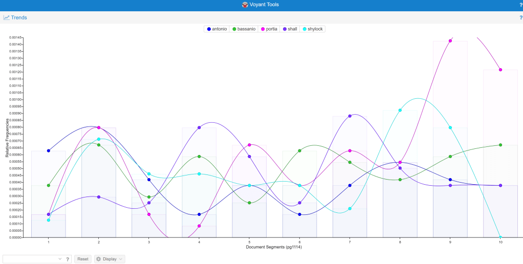
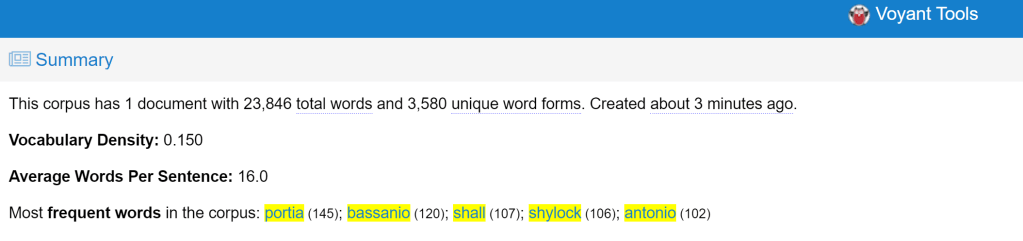
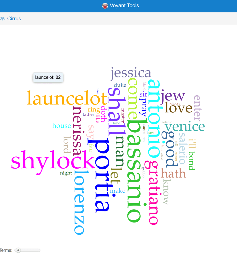
The Shakespearean play that I chose was The Merchant in Venice because in high school I took a Shakespeare class so I read a lot of his plays and this is the one I enjoyed the most. As this being my first time seeing a voyant text analysis it was really cool to see words displayed like that. I was always used to seeing words in a paragraph but seeing words contextualized into graphs was interesting. The word map allows people to see what words were used the most throughout the whole play. The summary shows the vocabulary density which is a measurement of vocabulary usage in comparison to the length of a document. The graph shows how many times a word was used in each section. Seeing words like this contributes to our understanding of and engagement with literary text by having an outline of the plot. Since I have read the play before looking at the word chart I can tell that where the amount of times Portia drastically increases is where she goes into court disguised as a man. Just by looking at the chat one can know where key plot points happen.
 Karisha Pradhan